AMBOSS is a medical knowledge platform for doctors and students used by a million medical professionals in over 180 countries.
Role: Senior Graphic Design Manager
Markets: Clinicians and Students US, DE, RoW
Duration: 2020 — 2023
Markets: Clinicians and Students US, DE, RoW
Duration: 2020 — 2023
Projects
Improved workflow and processes company-wide by changing the working program from Adobe Photoshop to Figma. This entailed organising files and structure, creating and automating 100+ digital templates in Figma, running several workshops and onboarding sessions for 6+ teams of the company, and supporting them with feedback and review sessions afterward (35+ people). Additionally, improved design quality and knowledge sharing by implementing regular overview checks, design sharing, performance marketing deep dives and campaign overview sessions.
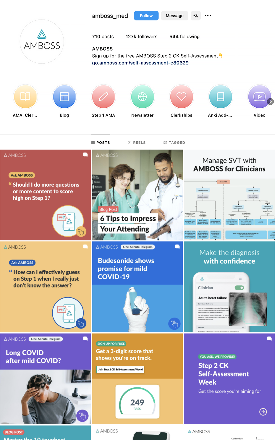
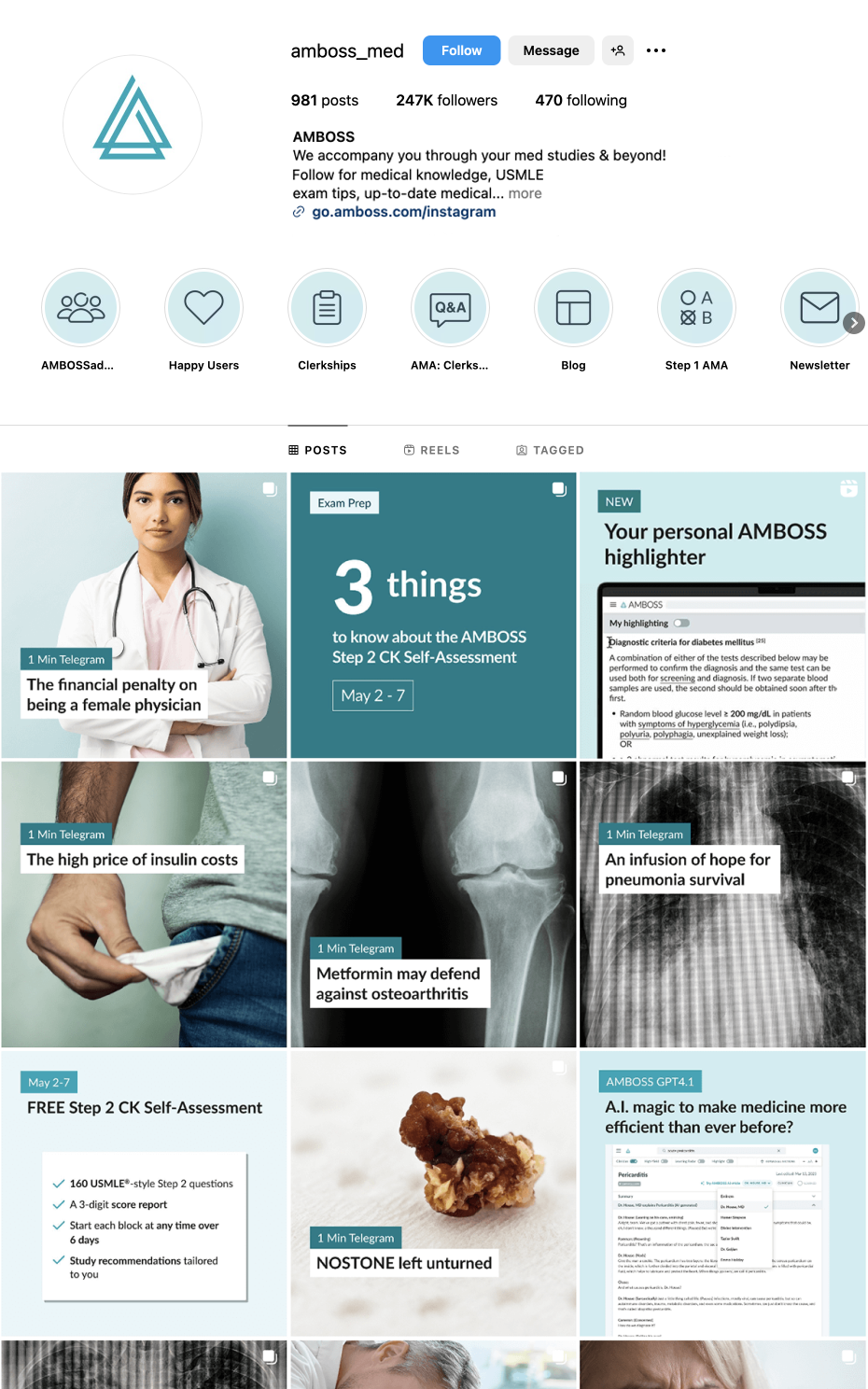
Instagram Overview. Before and after
Streamlined the color scheme to focus on the main brand color, simplifying the Instagram page overview. Removed the logo from daily posts, improved the flow, readability, and brand recognition.
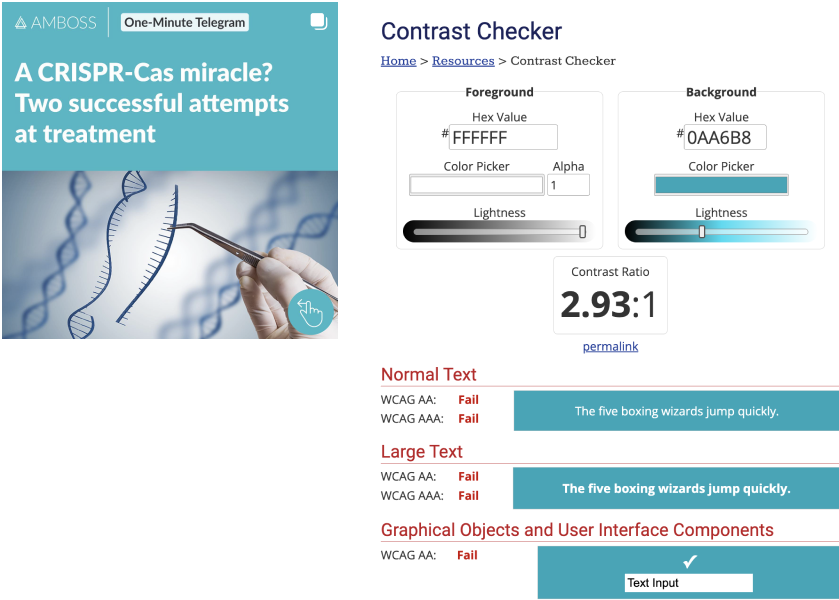
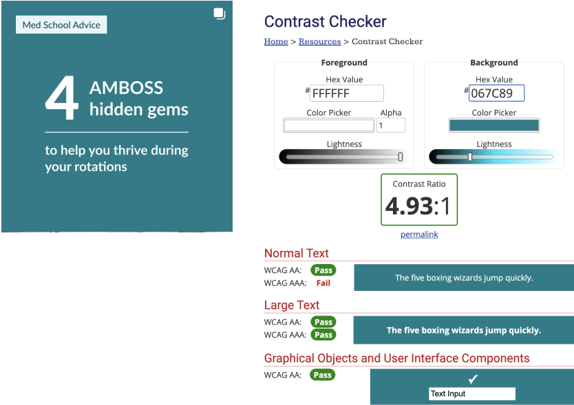
Accessibility Improvements. Before and after
A darker background color improves contrast and enhances readability. Avoid using white text on lighter brand colors.
A darker background color improves contrast and enhances readability. Avoid using white text on lighter brand colors.
Examples of New Templates
Simplified the view of Posts and Stories in order to improve readability and brand recognition.
Automation
Streamlined the flow and creation process of daily tasks by automating all templates.
Workshops for the Team
How to use and the most important create the automated templates, with step by step guidance.
App Store Update
Overview
Collaborated with the Medical Team to create App Store images aligned with the brand’s voice. These images enhance readability and highlight the app’s key features and benefits for medical students. The first four screens showcase the most popular features, with additional features presented afterward.
Medical Students Website Update
Enhanced the main page and subpages by establishing a cohesive style that aligns with the brand’s voice.
Enhanced the main page and subpages by establishing a cohesive style that aligns with the brand’s voice.
Landing Pages Template
Overview
Empowered local marketing teams for website and LPs creation by creating a LP template in in-house landing page builder platform, ran workshops, supported with improvements, feedback and reviewed digital and web work before publishing.
Overview
Empowered local marketing teams for website and LPs creation by creating a LP template in in-house landing page builder platform, ran workshops, supported with improvements, feedback and reviewed digital and web work before publishing.
Desktop Version Modules
Here is an overview of module sections that can be easily combined to create a landing page (LP). Content—such as text, images, GIFs, and videos—can be swapped out, allowing stakeholders to create LPs tailored to marketing campaigns, events, and partnerships. The layout was adapted to mobile and tablet versions.
CRM Modules Creation & Emails Redesign
Overview
Enabled the Customer Relationship Management team to create campaigns with ready-to-use modules that can be easily and quickly combined as well as a design system for marketing purposes. During the implementation process collaborated with the CRM team and developers, provided specifications and guidelines for the modules and gave feedback for test emails before sending them to users. As a result, delivered a holistic brand experience complementing product design, and the performance of emails was improved by a 94% increase of the click rate.
Stages of the project
— Discussion with Customer Relationship Management (CRM) team.
— Knowledge sharing. Limitations, requirements and possibilities. Evaluation of PD & Manus Design system.
— Research Trends & best practices. Definition of set of modules.
— Module development. Reviews, discussions, improvements.
— Collaboration with the CRM team and developers during the implementation process. Testing with existing email content.
— Created specifications and guidelines for the modules and gave feedback for test emails before sending them to users.
Before and after
Problem
— CRM design system wasn't developed and was outdated.
— We wasted resources recreating our marketing emails for campaigns, courses, special offers because existing ones were not compelling enough.
— It’s a content-heavy and sophisticated product, created by Physicians and for Physicians, mostly text heavy and some design solutions did not work.
— Our main message of email was included into image which was not displayed for some email clients.
Goals
Optimize email & campaign creation, Improve quality & accessibility and create trust through brand recognition.
Research
Made research Trends & Best Practices. After investigation created some basic rules for the next steps of the process:
— Prioritization of content. The majority of people scan emails within 10-15 seconds. The most important content should come first — above the fold, so the viewer doesn't need to scroll. Keep emails short.
— Balance of content. Always use more text than images (60% text, 40% images). Don’t rely on images to tell your story and don’t use images for the call to action buttons, since they may not render. The fewer elements in the email, the less likely it is to render improperly or trigger a SPAM filter.
Starting
The idea was to create a modular system to empower CRM team to send new campaigns quickly without creating Asana tasks and other teams involvement to save time and costs. I worked closely with CRM team, discussed WIP in sync meetings, looked into market analysis for different target groups and speacialty of emails. After gathering all the inputs from stakeholders and limitations, requirements from CRM team, we collected a base of information for every content block and started with modular system creation.
Process
The first we started with separated modules creation for each block of content. Then later when we put them into one email we saw that we don't have balanced flow of the story we're trying to tell. Each module took atention and overall the email looked messy. After this we simplified our modules, reduced color, font lybraries and elements.
Content organization
The full-width column layout is easier to read because a hierarchy is maintained and readers find the information where they expect it.
The use of a lot of white space visually separates the design elements. This allows the reader to understand and process information within seconds of skimming it. The call-to-action button is prominent and hard for the reader to miss. The structure is focused on clear sections that provide visual organisation.
The use of a lot of white space visually separates the design elements. This allows the reader to understand and process information within seconds of skimming it. The call-to-action button is prominent and hard for the reader to miss. The structure is focused on clear sections that provide visual organisation.
Responsive design
— More than 50% of emails are opened on mobile devices. The responsive template is optimized for both desktop and mobile devices.
— Single-column pages work best with mobile users as they require little effort to ensure that responsiveness is not compromised.
— The most important content comes first — above the fold.
— Single-column pages work best with mobile users as they require little effort to ensure that responsiveness is not compromised.
— The most important content comes first — above the fold.
CTA Content
— Call to action stands out from the rest of the email content through size and color. CTA text should be short and meaningful (max. 20 letters).
— The CTA is placed above the fold, and can be repeated below if necessary.
— Multiple CTAs (max. 2-3) in your email can serve for different use cases or offer value to two segments of the audience.
— Example: CTA for a webinar, CTA for more data-based information.
— The CTA is placed above the fold, and can be repeated below if necessary.
— Multiple CTAs (max. 2-3) in your email can serve for different use cases or offer value to two segments of the audience.
— Example: CTA for a webinar, CTA for more data-based information.
Modules Overview
Components Overview
Here is just a selection of components, the list is not exhaustive.
Here is just a selection of components, the list is not exhaustive.
Image Optimization
— Use JPG and GIFS images in emails. Use GIFs sparingly and only if they aren’t too large. PNGs should be avoided in email templates, because they're not supported in Lotus Notes.
— Use twice the image size of normal displays for retina displays.
— Use image alt text so readers can read what your images are about if their email clients do not display them. Good alt text will still motivate clicks.
— Use twice the image size of normal displays for retina displays.
— Use image alt text so readers can read what your images are about if their email clients do not display them. Good alt text will still motivate clicks.
Modules Specification
During the implementation process collaborated with developers, provided specifications and guidelines, feedback for improvements.
Results
Optimized email & campaign creation, Improved quality & accessibility and created trust through brand recognition. As a result, delivered a holistic brand experience complementing product design, and the performance of emails was improved by a 94% increase of the click rate.

